Explore a comprehensive collection of UPSC Prelims Topic Wise Questions focusing on Basic Numeracy – Data Interpretation. Delve into a diverse range of questions designed to enhance your understanding and preparation for the UPSC Preliminary examination, specifically in the realm of data interpretation. Covering various aspects of numerical data analysis, this resource offers a structured approach to mastering key concepts and techniques necessary for success. With a strategic emphasis on topic-wise questions, aspirants can refine their numerical reasoning skills and sharpen their analytical abilities in interpreting data effectively. Whether you’re a beginner or an advanced candidate, these meticulously curated questions provide valuable insights and practice opportunities to excel in the competitive UPSC environment. Prepare diligently, grasp essential insights, and boost your confidence to ace the UPSC Prelims with proficiency in data interpretation within the realm of basic numeracy.
Contents
- 1 Q1. Consider the diagram given below. (1995)
- 2 Q2. Consider the table given below providing details of traffic volume per hour for four locations. (1995)
- 3 Q3. The variations in temperatures form 0°C to 100°C with respect to time of two liquids P, Q are shown in the graph given below (1995)
- 4 Q4. The price fluctuations of 4 scrips in a stock market in the four quarters of a year are shown in the table below. Four different investors had the following portfolios of investment in the four companies throughout the year. (1995)
- 5 Q5. The following table shows the percentage distribution of revenue expenditure of Government of India in 1989-90 and 1994-95. (1996)
- 6 Q6. The following figure represents sales (in thousands), over the period 1978 to 1983. (1996)
- 7 Q7. The given pie charts show the proportion of literates and illiterates in a country, in the year 1970 and 1990, (1996)
- 8 Q8. The number of students in two sections, A and B having different heights is shown in the following table. (1997)
- 9 Q9. The following table shows the percent change in the amount of sales (in rupees) at different retail stores in a given neighbourhood market in the period 1993 to 1995 (1997)
- 10 Q10. The misery index is the sum of a country’s unemployment and inflation rate. The higher the index, the more miserable is the country to live in. The figure given below is the misery index for various countries in Europe. (1998)
- 11 Q11. Production of Rice and Wheat (in ‘million of tonnes”) (1998)
- 12 Q12. Year -wise variation of the price of a certain commodity is shown in the following graph. (2015)
- 13 Q13. The proportion of expenditure on various items by two families A and B are represented in the following bar charts. (2015)
- 14 Q14. Looking at the graph, it can be inferred that from 1990 to 2010. (2018)
- 15 Q15. With reference to the above graph, consider the following statements considering 1970 as base year. (2018)
- 16 In case you still have your doubts, contact us on 9811333901.
Q1. Consider the diagram given below. (1995)

T: Transport
Ec: Education and children
H: Housing
C: Clothing
F: Food
S: Savings
O: Others
From the diagram shown it would be right to conclude that
(a) the family spent more than half of income on food and clothing
(b) the amount saved by the family was too little
(c) the family had no health problems
(d) the family managed to meet all the essential expenses out of the income earned
Ans. (d)
Based on the given diagram, the family does not allocate more than half of its income to food and clothing expenses. Additionally, the amount saved by the family is sufficient, indicating it is not too little. Any potential health-related expenses are likely categorized under the “others” category. Overall, the family effectively manages to cover all expenses using its income.
Q2. Consider the table given below providing details of traffic volume per hour for four locations. (1995)
| Location | Total Traffic | Percentage of Heavy Vehicles | Average Noise Level | Noise Pollution Level |
| I | 377 | 24.40 | 73.50 | 84.00 |
| II | 380 | 12.50 | 72.60 | 83.00 |
| III | 377 | 30.00 | 73.50 | 86.50 |
| IV | 225 | 12.50 | 72.98 | 80.90 |
When the total traffic volume is the same, respectively the factor(s) which affect(s) the noise pollution level is/are
(a) percentage of heavy vehicles
(b) noise pollution level and average noise level
(c) average noise level and percentage of heavy vehicles
(d) indeterminable on the basis of details given
Ans. (a)
From locations I and III, it can be observed that the traffic volume is the same. As the average noise level is also the same for both locations, the differing factor is the percentage of heavy vehicles. Therefore, it is evident that the percentage of heavy vehicles directly impacts the noise pollution level.
Q3. The variations in temperatures form 0°C to 100°C with respect to time of two liquids P, Q are shown in the graph given below (1995)
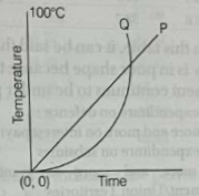
Which one of the following statements is correct?
(a) During heating, liquid P remained hotter than liquid Q throughout
(b) At no point of time during heating did the two liquids have the same temperature
(c) P attained the temperature of 100°C faster than Q
(d) Q attained the temperature of 100°C faster than P
Ans. (d)
As depicted in the graph, it’s evident that Q reaches a temperature of 100°C more rapidly compared to P.
Q4. The price fluctuations of 4 scrips in a stock market in the four quarters of a year are shown in the table below. Four different investors had the following portfolios of investment in the four companies throughout the year. (1995)
Portfolios
Investor 1: 10 of A, 20 of B, 30 of C, and 40 of D
Investor 2: 40 of A, 10 of B, 20 of C, and 30 of D
Investor 3: 30 of A, 40 of B, 10 of C, and 20 of D
Investor 4: 20 of A, 30 of B, 40 of C, and 10 of D
Stock Market Performance
| I Quarter | II Quarter | III Quarter | IV Quarter | |
| Scrip A | UP 10% | Down 15% | UP 10% | Down 10% |
| Scrip B | UP 2% | UP 1% | UP 2% | UP 2% |
| Scrip C | UP 1% | UP 1% | Down 5% | Down 1% |
| Scrip D | UP 20% | Down 15% | UP 30% | Down 10% |
In the light of the above which one of the following statement is correct?
(a) Investor 2 has made the best investment
(b) Investor 1 has made the best investment
(c) Investor 2 suffered a net loss during the year
(d) Investor 3 suffered a net loss during the year
Ans. (b)
According to the portfolios table, it is apparent that investor 1 has allocated a larger portion of their investment in scrip D, which exhibits the least decrease. This results in the best average investment performance by investor 1 compared to the others.
Q5. The following table shows the percentage distribution of revenue expenditure of Government of India in 1989-90 and 1994-95. (1996)
Expenditure Head (percent to total)
| Years | Defence | Interest Payments | Subsidies | States/Uts Grants to | Other |
| 1989-90 | 15.1 | 27.7 | 16.3 | 13.6 | 27.4 |
| 1994-95 | 13.6 | 38.7 | 8.0 | 16.7 | 23.0 |
Based on this table, it can be said that the Indian economy is in poor shape because the Central government continues to be under pressure to
(a) reduce expenditure on defence
(b) spend more and more on interest payments
(c) reduce expenditure on subsidies
(d) spend more and more as grants-in-aid to State government/Union Territories
Ans. (b)
Based on the data illustrating revenues and expenditures of the Indian Government, it appears that the Indian economy is facing challenges, particularly due to the increasing debt payments. The rising burden of debt payments leaves less financial resources available for other purposes.
Q6. The following figure represents sales (in thousands), over the period 1978 to 1983. (1996)
The sales in 1981 exceeded that in 1979 by

(a) ₹100
(b) ₹10000
(c) ₹100000
(d) ₹1000000
Ans. (c)
Given the sales in the year 1979 are 320,000 and the sales in the year 1981 are 420,000. Therefore, the required difference is calculated as 420,000 – 320,000, resulting in a difference of 100,000.
Q7. The given pie charts show the proportion of literates and illiterates in a country, in the year 1970 and 1990, (1996)

and also the proportion of males (M) and females (F) among the literates. Which one of the following statements can be said to be true beyond any doubt?
(a) In 1970 half of the illiterates were women (females)
(b) The proportion of literate males to the total population of males remained the same over the years
(c) Male literacy did not improve over this period
(d) The ratio of female literates to male literates improved significantly over this period
Ans. (d)
The chart clearly illustrates an improvement in the ratio of female literates to male literates over time.
Q8. The number of students in two sections, A and B having different heights is shown in the following table. (1997)
| Height (in metres) | Number of students in section A | Number of students in section B |
| 1.55 | 3 | 2 |
| 1.60 | 7 | 6 |
| 1.62 | 12 | 14 |
| 1.65 | 15 | 14 |
| 1.68 | 8 | 9 |
| 1.71 | 6 | 5 |
| 1.75 | 3 | 4 |
The ratio of the number of students of a particular height in section A to that in section B is the maximum for the height of
(a) 1.55 m
(b) 1.60 m
(c) 1.65m
(d) 1.71m
Ans. (a)
For a height of 1.55 m, the ratio is 3/2 = 1.5 .
For a height of 1.60 m, the ratio is 7/6 = 1.16.
For a height of 1.65 m, the ratio is 15/14 = 1.07.
For a height of 1.71 m, the ratio is 6/5 = 1.2
Hence, the ratio of students in section A to B is maximum for the category of height 1.55 m.
Q9. The following table shows the percent change in the amount of sales (in rupees) at different retail stores in a given neighbourhood market in the period 1993 to 1995 (1997)
| Retail store | Percent Change 1993 to 1994 | Percent Change 1994 to 1995 |
| Anshu | +10 | -10 |
| Borna | -20 | +9 |
| Calpo | +5 | +12 |
| Dilip | -7 | -15 |
| Elegant | +17 | -8 |
If the sales at Anshu store amounted to 8 lakh in 1993, then the amount of sales (in lakh rupees) at that store in 1995 was
(a) 7.92
(b) 8.00
(c) 8.80
(d) 9.68
Ans. (a)
If there are two changes x% and y%,
Net change = 10 – 10 + 10(-10)/100 = -1%
Since, Net change = x + y + (xy)/100
Therefore, Amount of sales in 1995 = 8(1-(1/100)) = 7.92
Q10. The misery index is the sum of a country’s unemployment and inflation rate. The higher the index, the more miserable is the country to live in. The figure given below is the misery index for various countries in Europe. (1998)

Which of the following conclusions can be drawn from the misery index given above?
1. Britain is the most miserable country to live in
2. The inflation rate in Spain is less than that in Belgium and Britain
3. Italy and France seem to have almost identical unemployment
4. The higher the misery index, the higher the inflation rate
Select the correct answer using the codes given below
Codes
(a) Only 1
(b) 2 and 3
(c) 1, 2, 3 and 4
(d) None of the above
Ans. (b)
The inflation rate in Spain is lower than that in Belgium and Britain. On the graph, Italy and France appear to have nearly identical levels of unemployment.
Q11. Production of Rice and Wheat (in ‘million of tonnes”) (1998)
| Year | Rice | Wheat | Percentage of Wheat to Rice |
| 1950-51 | 20.58 | 6.46 | 31.4 |
| 1960-61 | 34.58 | 11.00 | 31.8 |
| 1970-71 | 42.22 | 23.83 | 56.4 |
| 1980-81 | 58.63 | 36.31 | 67.7 |
| 1990-91 | 74.29 | 55.14 | 74.2 |
| 1994-95 | 81.81 | 65.77 | 80.4 |
| 1995-96 | 79.62 | 62.62 | 78.6 |
The above table indicates the performance of India in rice and wheat production from 1950-51 to 1995-96. Which of the following conclusions arrived at from the above table would be valid?
1. Record production of rice as well as wheat has been increasing in 1994-95.
2. The ratio of wheat to rice production seems to have steadily increased over 16 yr.
3. Wheat has not been popular among the Indian population before 1980.
4. India became self-sufficient in rice and wheat only after 1990.
Select the correct answer using the codes given below:
Codes
(a) 1 and 2
(b) 1, 2, 3 and 4
(c) 3 and 4
(d) None of the above
Ans. (a)
According to the provided table, it is evident that the production of rice and wheat reached record levels in 1994-95, with 81.81 million tonnes and 65.77 million tonnes respectively. Additionally, production appears to have consistently risen from 1980 to 1995.
Q12. Year -wise variation of the price of a certain commodity is shown in the following graph. (2015)
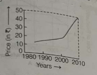
The price of the commodity in the year 1990
(a) must have been ₹10
(b) must have been ₹12
(c) must have been anywhere between ₹10 and ₹20
(d) is higher than that in the year 1991
Ans. (c)
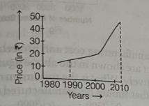
The price of that product in 1990 likely ranged from ₹10 to ₹20.
Q13. The proportion of expenditure on various items by two families A and B are represented in the following bar charts. (2015)

From these charts, we can conclude that
(a) Family A spent more money on food than Family B
(b) Family B spent more money on food than Family A
(c) Family A and Family B spent the same amount on food
(d) The expenditure on food by Family A and Family B cannot be compared
Ans. (c)
From the given bar charts,
Expenditure of Family A on food = 20000 X (50/100) = ₹10000
Expenditure of Family B on food = 100000 X (10/100) = ₹10000
It’s evident that both Family A and Family B allocated equal amounts to food expenses.
Directions: (Q.14 and 15) Consider the following graph in which the birth rate and death rate of a country are given and answer the two questions that follow.
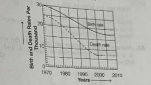
Q14. Looking at the graph, it can be inferred that from 1990 to 2010. (2018)
(a) population growth rate has increased
(b) population growth rate has decreased
(c) growth rate of population has remained stable
(d) population growth rate shows no trend
Ans. (a)
The disparity between the birth rate and death rate provides insights into the population growth rate. In 1990, with a death rate of 13 and a birth rate of 23, the difference is 10, indicating a population growth rate. Similarly, in 2000, with a death rate of 7 and a birth rate of 18, the difference is 11, also indicating a population growth rate. In 2010, with a death rate of 6 and a birth rate of 18, the difference is 12, further indicating a population growth rate. Consequently, from 1990 to 2010, there has been an increase in the population growth rate.
Q15. With reference to the above graph, consider the following statements considering 1970 as base year. (2018)
1. Population has stabilised after 35 years.
2. Population growth rate has stabilised after 35 years.
3. Death rate has fallen by 10% in the first 10 years. 4. Birth rate has stabilised after 35 years.
Which of the above are the most logical and rational statements that can be made from the above graph?
(a) 1 and 2
(b) 1, 2 and 3
(c) 3 and 4
(d) 2 and 4
Ans. (d)
We can derive population growth rate from the graph, but we cannot ascertain the population directly. Therefore, statement (1) is not accurate.
Observing the graph from 2005 to 2010, we notice that the birth rate remains constant at 18, and the death rate remains constant at 6. This stability indicates that the population growth rate has stabilized after 35 years.
In case you still have your doubts, contact us on 9811333901.
For UPSC Prelims Resources, Click here
For Daily Updates and Study Material:
Join our Telegram Channel – Edukemy for IAS
- 1. Learn through Videos – here
- 2. Be Exam Ready by Practicing Daily MCQs – here
- 3. Daily Newsletter – Get all your Current Affairs Covered – here
- 4. Mains Answer Writing Practice – here

